
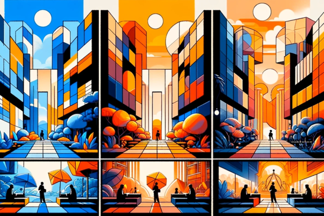
The Colorful World of Motion Graphics
Imagine you’re walking through a gallery of motion graphics, each piece a burst of colors that speak louder than words. In this world, colors aren’t just shades; they’re the silent narrators of stories, setting the stage for emotions and reactions. As a Motion Graphics Artist, I’ve come to realize that understanding color psychology is like having a superpower – it’s the key to creating visuals that not only catch the eye but also capture the heart.
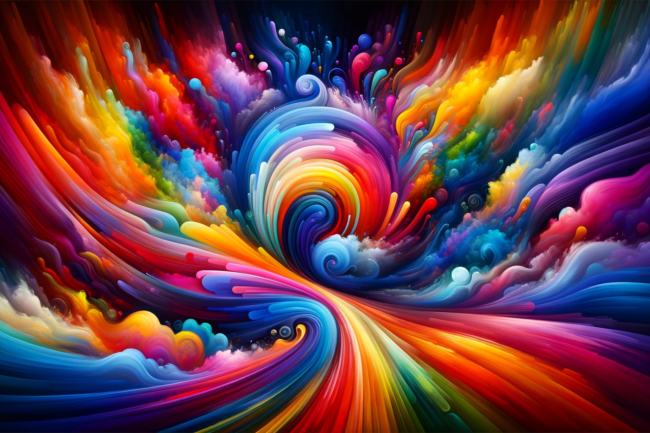
Color psychology in motion graphics is a fascinating journey. It’s not just about splashing bright hues across the screen; it’s about using color to connect, to evoke, to engage. Every color has a story, a mood, and an impact. From the calming whispers of blues to the fiery shouts of reds, colors in motion graphics are powerful tools in our creative arsenal.
Let’s dive into this vibrant world, where I’ll share insights, a few laughs, and maybe even some cautionary tales about the times colors took the driver’s seat in my projects. You’ll learn not just to see colors but to feel them, to understand their language, and to use them to weave emotional narratives in your motion graphics. Welcome to the art and science of color psychology, where every hue is a clue to a deeper connection with your audience.
 Understanding Color Psychology
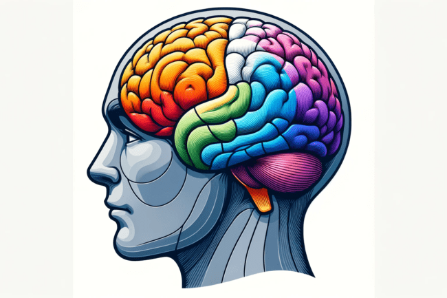
In the world of colors, where every hue holds a secret power to influence emotions and behaviors. It’s like having a remote control for the viewer’s feelings, but instead of buttons, you have a palette of colors.
The Emotional Spectrum
Color psychology isn’t just a fancy term; it’s a real phenomenon backed by science. Each color triggers specific emotional responses. For instance, red isn’t just a color; it’s a mood, an energy, a statement. It can shout ‘danger’ or whisper ‘passion.’ Blue, on the other hand, is like the ocean – sometimes calm and serene, sometimes deep and mysterious.
The Green Dilemma
Let me tell you a story. Once, I worked on a campaign that used various shades of green. Our goal was simple: convey growth and harmony. Easy, right? Wrong. We quickly learned that green has many faces. A bright, lime green might scream ‘innovative and fresh,’ but get it wrong, and it screams ‘radioactive avocado.’ We had to navigate through a forest of greens to find the one that perfectly said ‘growth’ without turning our audience into salad enthusiasts.
More Than Meets the Eye
Understanding color psychology in motion graphics is like being a chef. Just as a chef combines flavors to create a dish that evokes a specific taste and feeling, a motion graphics designer blends colors to evoke specific emotional responses. It’s not just about what looks good; it’s about what feels right.
This section of our colorful journey lays the foundation for why and how colors affect us. As you explore further, you’ll learn to wield the power of colors, not just to catch the eye but to touch the heart and stir the soul. Now we’ll delve deeper into the science behind these colorful emotional triggers.
The Science of Color in Motion Graphics
This isn’t just about picking pretty colors; it’s about understanding how these colors work together to convey a message, set a mood, and create an impact.
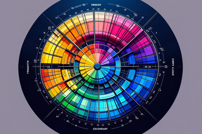
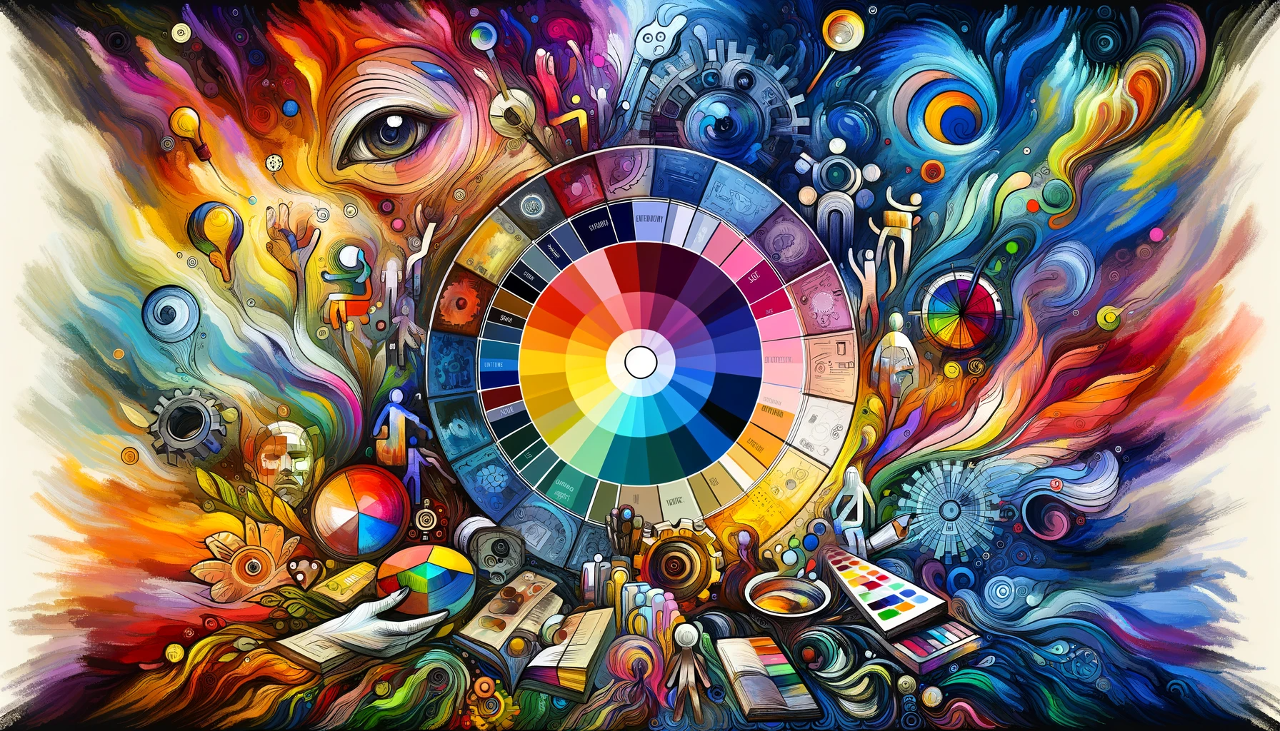
The Color Wheel: Your New Best Friend
Remember the color wheel from art class? Well, it turns out it’s more than just a pretty circle. It’s a roadmap to understanding color relationships. Primary colors (red, blue, yellow) are the building blocks. Combine them, and you get secondary colors. Mix those, and voila – tertiary colors! But it’s not just about mixing colors; it’s about understanding how they interact with each other and the viewer.
check out “A Guide to Color Theory for Motion Design” from LottieFiles
Emotional Alchemy
Different colors evoke different feelings. Red can increase heart rate, creating a sense of urgency or excitement. Blue, often seen as trustworthy and serene, can have a calming effect. And let’s not forget green – the color of nature, often used to evoke feelings of peace and tranquility. But here’s where it gets interesting: combine these colors, play with their saturation and brightness, and you create a whole new emotional spectrum.
The Blue Experiment
Once, on a whim, I experimented with shades of blue for a product ad. The goal was to create a sense of trust and reliability. We went with a deep, confident navy blue. The result? The ad performed exceptionally well, with viewers reporting a sense of security and trust in the product. It was a clear reminder that sometimes, the right shade can make all the difference.
Beyond the Basics
Color theory in motion graphics isn’t just about the colors themselves; it’s about how they’re used. It’s about balance, contrast, and harmony. It’s about using color to guide the viewer’s eye, create depth, and emphasize key elements.
Emotional Impact of Specific Colors
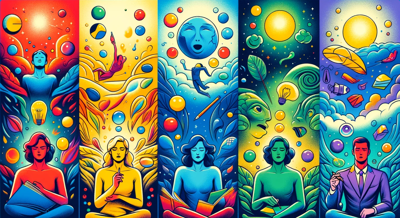 Red: The Color of Excitement and Alert
Red is the universal sign of excitement, energy, and passion. It’s the color of stop signs and fire trucks, demanding attention. In motion graphics, red can be a double-edged sword – use it to create a sense of urgency or highlight important elements, but too much can be overwhelming.
Blue: Calm, Trustworthy, and Professional
Blue is your go-to for creating a sense of stability and trust. It’s no coincidence that many corporate logos are blue. It suggests professionalism and reliability, making it ideal for projects aiming to instill confidence.
Yellow: The Bright Side of Life
Yellow, the color of sunshine, is all about happiness and optimism. It’s perfect for grabbing attention and injecting energy into your designs. However, its brightness can be jarring if overused, so handle with care.
Green: Nature’s Embrace
Green is the heart of nature, symbolizing growth, harmony, and freshness. It’s a versatile color, used to promote environmental issues or to soothe and reassure. The right shade of green can create a refreshing and invigorating experience.
Purple: A Touch of Royalty and Mystery
Purple, historically the color of royalty, adds a touch of luxury and mystery to your designs. It’s perfect for conveying sophistication and creativity.
Orange: Fun, Dynamic, and Energetic
Orange, a blend of red’s passion and yellow’s joy, is a vibrant and playful color. It’s great for designs that aim to be friendly, youthful, and energetic.
These colors, when used effectively, can significantly enhance the emotional impact of your motion graphics. By understanding the emotional connotations of each color, you can make informed decisions that resonate with your audience on a deeper level.
Color Harmonies and Contrasts
 Crafting Harmony with Colors
Color harmonies are about creating a visually pleasing balance using color combinations. These can range from monochromatic schemes, which use various shades of a single color, to more complex arrangements like analogous, complementary, and triadic schemes. For instance, an analogous color scheme uses colors that are next to each other on the color wheel, creating a serene and comfortable design, while a complementary scheme uses opposite colors for a more vibrant and dynamic look.
The Power of Contrast
Contrast in color is crucial in motion graphics. It’s not just about making things stand out; it’s about guiding the viewer’s eye to where you want it. High contrast color combinations can bring forward important elements, create depth, and add drama. Low contrast, on the other hand, can be used to create subtle, understated designs.
Using Discordance for Attention
Color discordance involves using a color that clashes with the rest of the palette. This can be a powerful tool for drawing attention to a specific element. But beware, overusing discordance can lead to visual chaos.
Black and White: The Unsung Heroes
Often overlooked, blacks, whites, and grays can provide a sophisticated backdrop, allowing your colors to pop and maintain the viewer’s focus.
By mastering these aspects of color harmonies and contrasts, motion graphics professionals can create visually stunning and emotionally engaging pieces that resonate with their audience
Cultural and Contextual Influences on Color Perception
 In the realm of motion graphics, understanding the cultural and contextual nuances of color is paramount. Colors are not just universal symbols; their meanings can shift dramatically across different cultures and contexts.
Cultural Color Codes
For instance, while white is often associated with purity and weddings in Western cultures, it represents mourning and funerals in many Asian cultures. Similarly, red, which signifies danger or passion in the West, is a color of luck and prosperity in China.
Context Matters
The context in which colors are used also plays a crucial role. The same color can convey different messages depending on its usage. A bright yellow in a children’s animation evokes joy and energy, whereas in a different context, like a cautionary sign, it signals warning and alertness.
Adapting to Audience Perceptions
As motion graphics professionals, it’s essential to be mindful of these cultural and contextual differences, especially in today’s globalized world. Understanding your audience’s background can help in choosing colors that convey the right message and evoke the intended emotional response.
This nuanced approach to color selection not only enhances the effectiveness of your motion graphics but also ensures they are culturally sensitive and resonant with diverse audiences.
Practical Tips for Using Color in Motion Graphics
When it comes to using color effectively in motion graphics, a few practical tips can go a long way in creating compelling visuals. These tips blend art with psychology, helping you to convey the right message and evoke the desired emotional response.
Choose Colors Strategically
Always start with a clear understanding of the message you want to convey. Choose colors that align with this message. For instance, use warm colors like red or orange to create excitement, or cool colors like blue or green to soothe and calm.
Balance is Key
Remember the 60-30-10 rule: 60% of your design should be the dominant color, 30% a secondary color, and 10% an accent color. This creates a visually appealing and balanced composition.
Consistency Across Frames
Ensure color consistency throughout your motion graphics. Inconsistent coloring can distract and confuse the viewer, detracting from the message.
Test for Different Viewing Conditions
Colors can appear differently on various screens or under different lighting conditions. Test your graphics in multiple environments to ensure they maintain their visual appeal and effectiveness.
Keep Up with Trends, but Stay Timeless
While it’s important to stay updated with color trends in motion graphics, aim for a balance between trendy and timeless to ensure your work remains relevant.
By incorporating these practical tips into your motion graphics projects, you can enhance their visual impact and ensure that they not only catch the eye but also resonate emotionally with your audience.
Conclusion
 In the kaleidoscope world of motion graphics, color is much more than a visual element; it’s a language that speaks directly to the heart. We’ve journeyed through the science of color psychology, explored how specific colors trigger emotions, and discussed the importance of cultural and contextual influences. We’ve also delved into practical strategies for effectively using color in motion graphics.
As you step forward in your creative endeavors, remember that color is a powerful tool. It can elevate your motion graphics from mere visuals to emotive experiences that resonate with audiences. Use color wisely, and let it be the bridge that connects your vision to the viewer’s emotions.
In motion graphics, every color tells a story. What story will you tell?